Quick jump |
|
Description
The ChartModify event occurs before a chart is displayed. Use this event to modify the chart settings.
Syntax
ChartModify(chart, proxy, pageObj)
Arguments
chart
a chart object.
proxy
data transferred from C#/VB.NET code using setProxyValue function.
pageObj
an object representing the current page. For more information, see RunnerPage class.
Applies to pages
Official AnyChart documentation: https://api.anychart.com/.
Examples
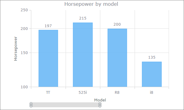
Example 1. Add a horizontal scroller.
var currentScroller = chart.xScroller();
currentScroller.enabled(true);
Example 2. Add a horizontal scroller and set the initial zoom to 50%.
var zoom = chart.xZoom();
zoom.setTo(0, 0.5);
var currentScroller = chart.xScroller();
currentScroller.enabled(true);
Example 3. Change labels color and font size.
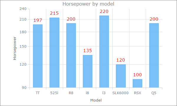
Using separate API calls to set the series color and font size:
// Gets the series by index, 0 - the first series, 1 - the second series, etc.
var series = chart.getSeriesAt(0);
series.labels(true);
series.labels().fontSize(15);
series.labels().fontColor("#ff0000");
Setting several label parameters in one go:
// Gets the series by index, 0 - the first series, 1 - the second series, etc.
var series = chart.getSeriesAt(0);
series.labels(true);
series.labels.{fontSize: 15, fontColor: "#ff0000"});
Example 4. The series appearance.
Single color:
// Gets the series by index, 0 - the first series, 1 - the second series, etc.
var series = chart.getSeriesAt(0);
series.color("#FF0000", 0.25);
Gradient fill:
// Gets the series by index, 0 - the first series, 1 - the second series, etc.
var series = chart.getSeriesAt(0);
series.color(["#FEFEFE", "#424242"], 0.69, 0.59);
Example 5. Customize the chart title.
Change the title color:
chart.title().fontColor("#FF0000");
Change the title and color:
chart.title({text: "Custom title", fontColor: "#F44336"});
Disable the title:
chart.title(false);
Formatting values as currency. You can use any JavaScript code to format values.
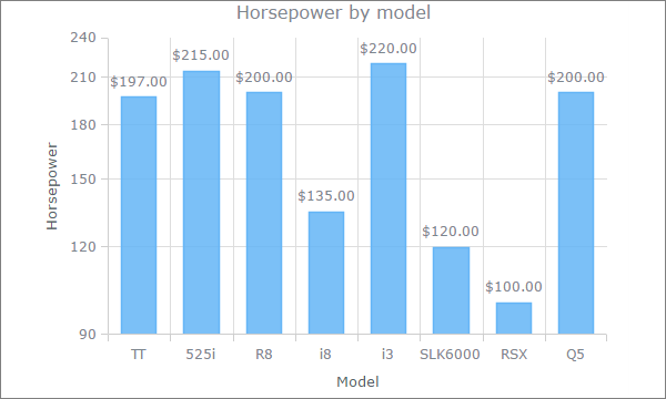
var series = chart.getSeriesAt(0);
series.labels().textFormatter(function(){
var num = Number(this.value);
return(("$"+num.toFixed(2)));
});
Here is how to add an extra Y-axis on the right ranging from 100 to 500 with ticks after each 50 points:
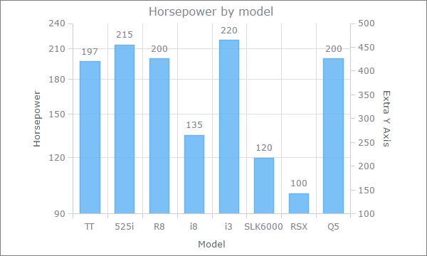
var extraYScale = anychart.scales.linear();
extraYScale.minimum(100);
extraYScale.maximum(500);
var extraTicks = extraYScale.ticks();
extraTicks.interval(50);
// Create and tune an additional y-axis
var extraYAxis = chart.yAxis(1);
extraYAxis.orientation("right");
extraYAxis.scale(extraYScale);
extraYAxis.title("Extra Y Axis");
Example 8. Adding range markers.
Here is how to add range markers:
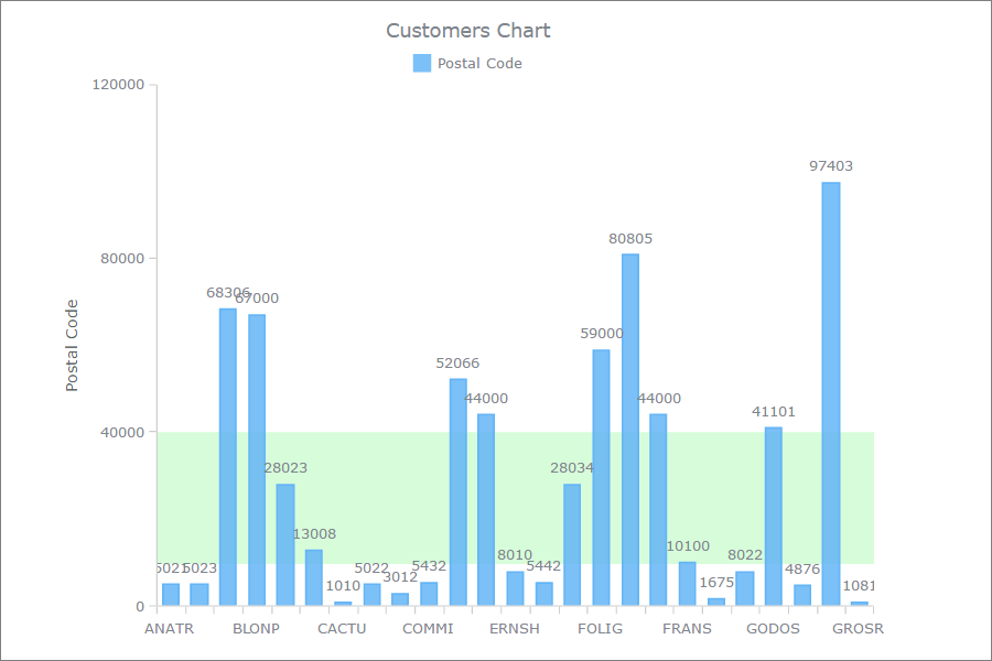
var vMarker = chart.rangeMarker(0);
vMarker.from("10000");
vMarker.to("40000");
vMarker.axis(chart.yAxis());
vMarker.fill("#d7fcda");
You can find more info at https://playground.anychart.com/docs/7.13.0/samples/AGST_Range_Marker_04-plain.
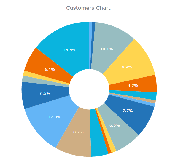
Example 9. How to change colors of individual slices in a pie/doughnut chart.
var palette = anychart.palettes.distinctColors();
palette.items(["#64B5F6", "#2374B8", "#97BDC1", "#FFD54F", "#EF6C00", "#0AB4DE", "#CFAE83"]);
chart.palette(palette);
If your pie chart has more slices than colors, you can specify which colors can be repeated.
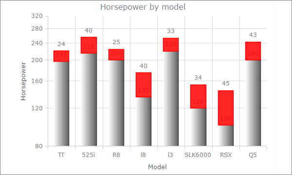
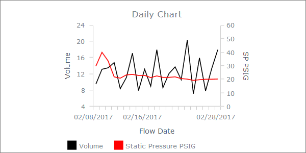
Example 10. How to create a two-series chart with two Y-Axis.
An example of a two-series chart with two Y-Axes. The idea is to choose such scales, so that it makes both series clearly visible.
var series2 = chart.getSeriesAt(1);
var extraYScale = anychart.scales.linear();
extraYScale.minimum(0);
extraYScale.maximum(60);
var extraTicks = extraYScale.ticks();
extraTicks.interval(10);
var extraYAxis = chart.yAxis(1);
extraYAxis.orientation("right");
extraYAxis.scale(extraYScale);
extraYAxis.title("Title right axis");
series2.yScale(extraYScale);
See also: